Project Info
The Brief
Social Enterprise NI approached Rapid to refresh their brand identity and bring it into a more modern, inclusive, and digitally adaptable space. Their original brand had served them well, but the organisation was ready for a new look that reflected their evolving role as a unifying voice for social enterprises across Northern Ireland.
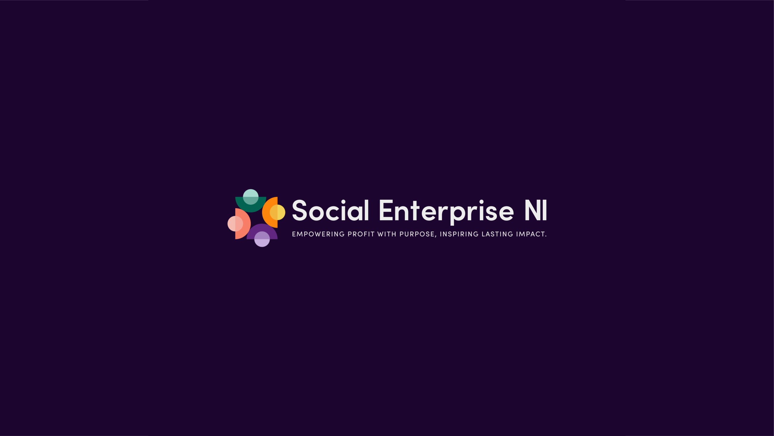
The goal was to create a brand system that members could feel ownership of, while positioning Social Enterprise NI as dynamic, approachable, and pioneering. The new identity celebrates community and connection – symbolised in a logo representing each county gathered around Lough Neagh – while remaining fluid, accessible, and inclusive for all audiences.
Creative process
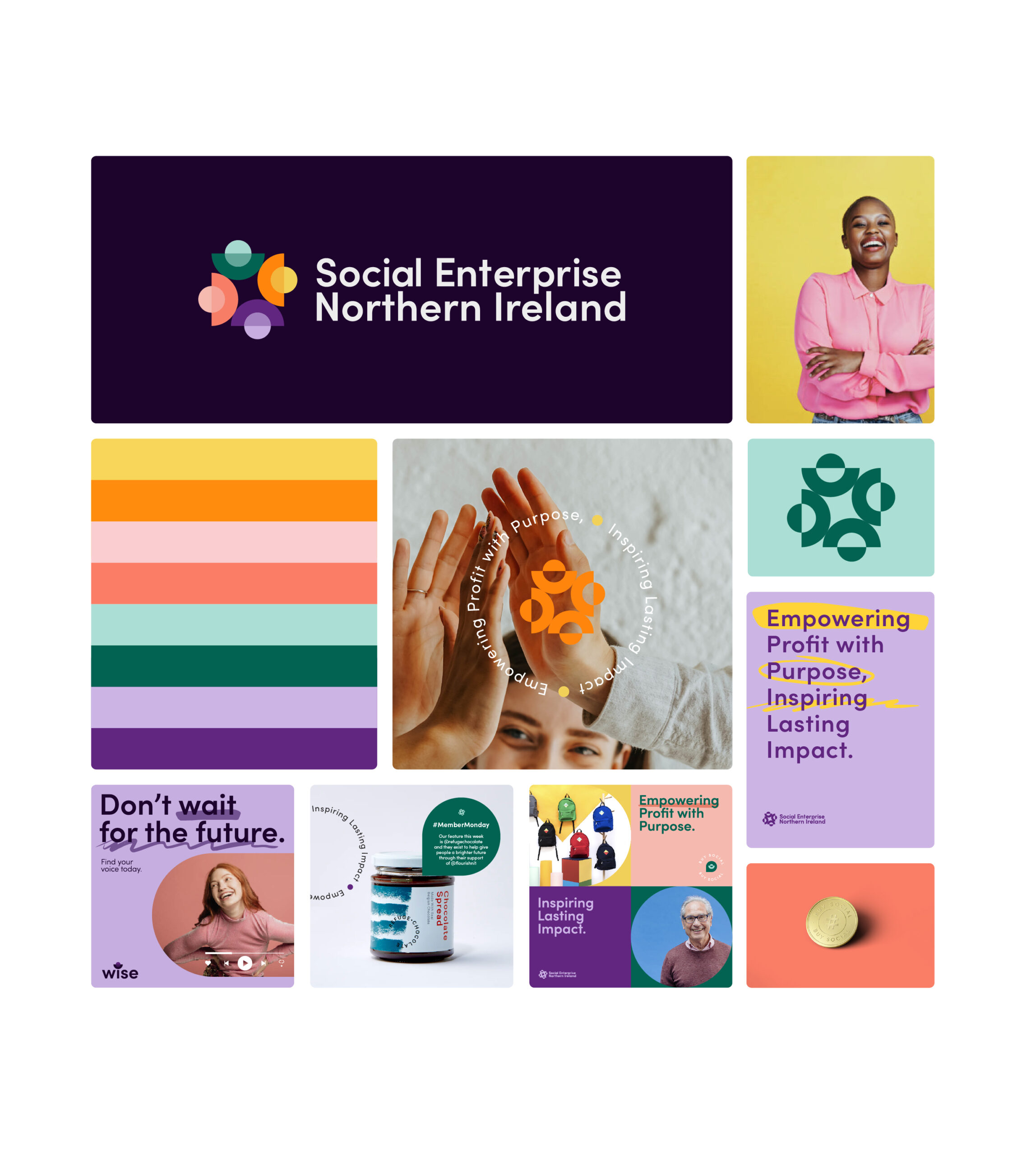
We partnered with Social Enterprise NI to develop a brand strategy that would amplify their impact and connect with a diverse audience. Drawing inspiration from the shape of Northern Ireland and its people, we crafted a visual identity that is inclusive, aspirational, and easily accessible – using geometric type for clarity and colours tested for contrast and accessibility.
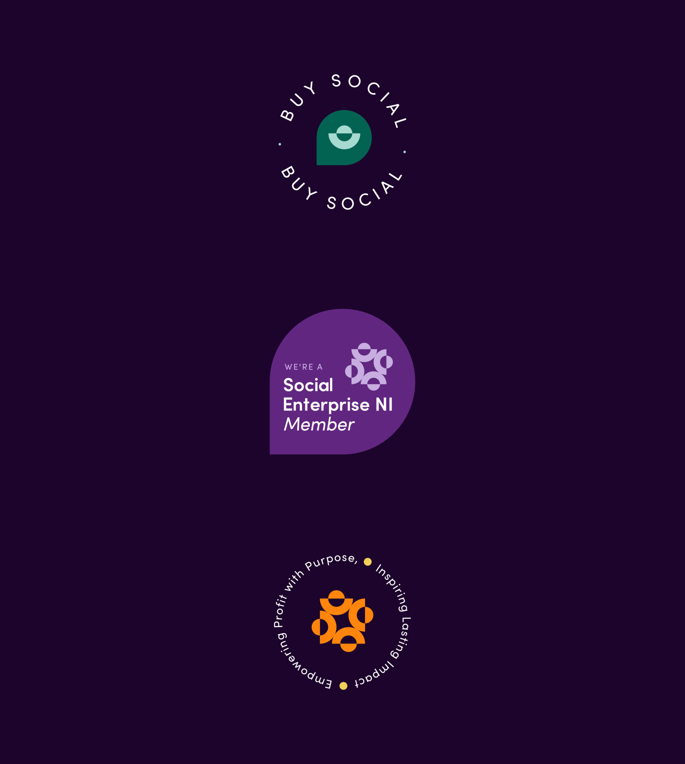
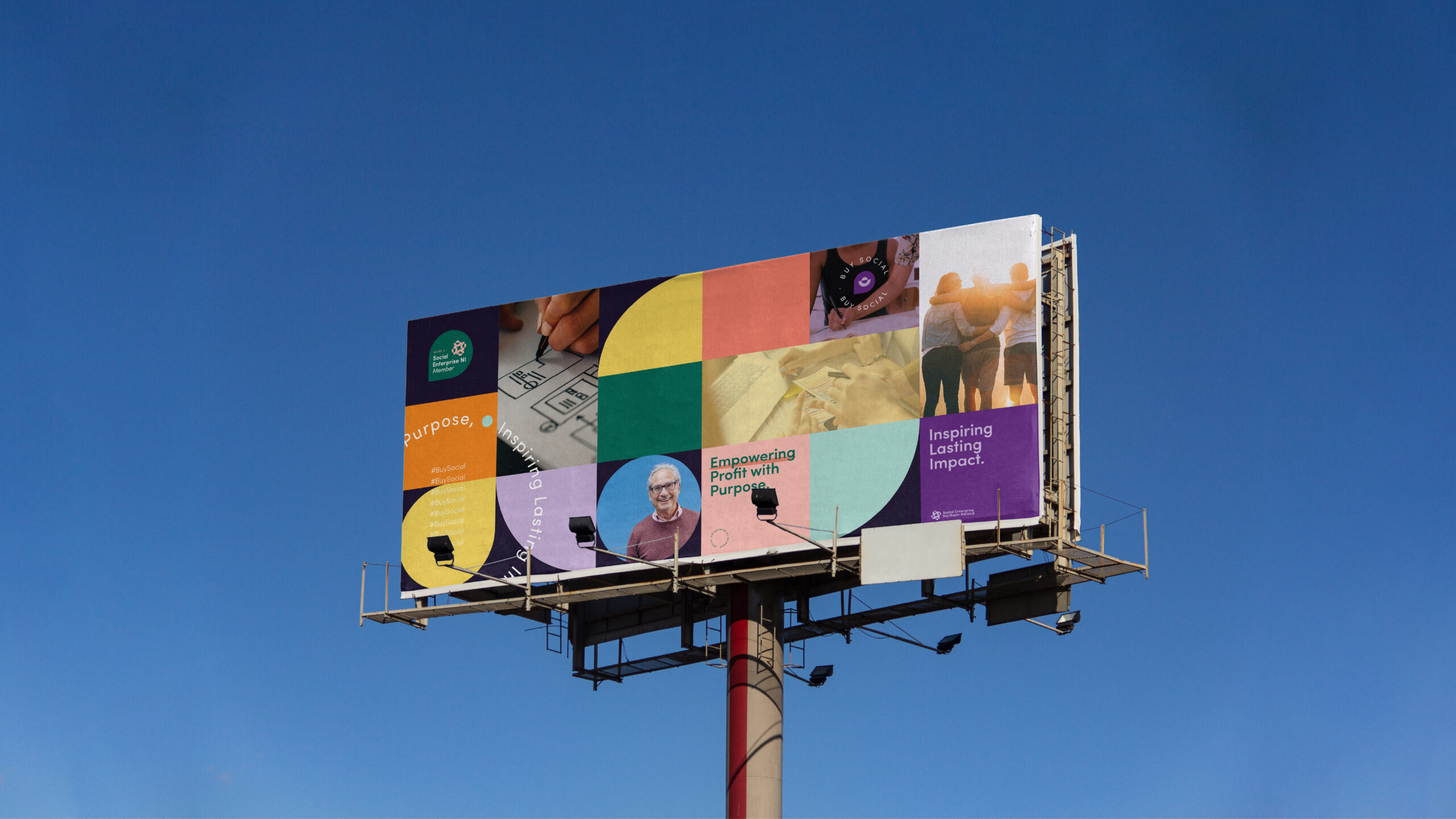
Practical considerations, like integrating the Social Enterprise NI Awards logo, guided our rollout, while feedback from the team helped refine elements such as Susie’s drop icon for social media and other applications. Together, we delivered a cohesive, vibrant brand that balances creativity with functionality, ready to inspire and engage across all touchpoints.
Results & Impact
The brand design we crafted for Social Enterprise NI not only visually represents their mission but also elevates their overall brand presence. A vibrant and inclusive colour palette, paired with a meaningful logo and thoughtful visual elements, ensures accessibility and resonates strongly with their audience. The brand reflects the organisation’s personality by creating a sense of ownership among social enterprises themselves – making it inclusive, approachable, and distinctive in a competitive space. The result is a brand that feels inviting to potential clients and stakeholders, strengthening engagement and fostering connection across the community.
Reflection & Learning
This project reinforced the importance of thinking bigger and prioritising collaboration. With more time or resources, we would have explored animation to further bring the brand to life.
Our advice for designers tackling a brand identity is to always consider the audience and how the brand will live in real-world applications – ensuring that every element, from colour to typography, serves both purpose and impact.
Social Enterprise NI
Social Enterprise NI is the representative body for social enterprises and social entrepreneurs across Northern Ireland.